Thursday 30 September 2010
FCUK - The Man and a little bit less of The Woman
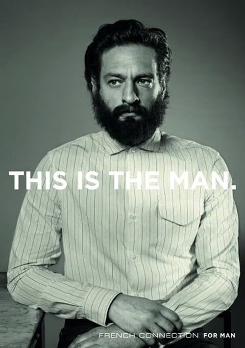
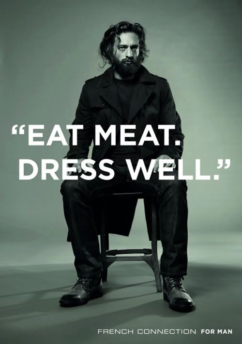
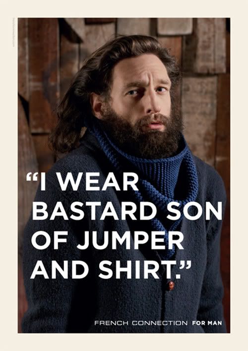
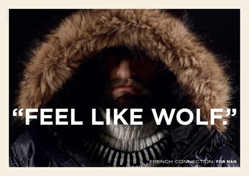
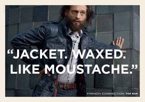
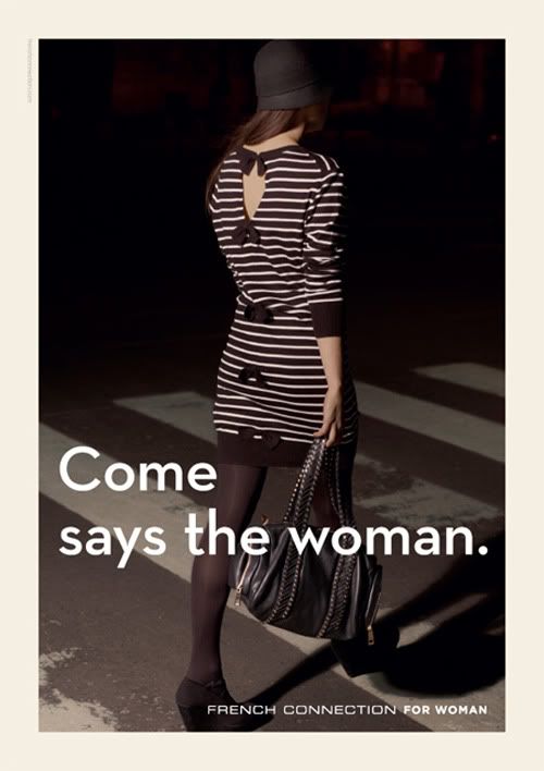
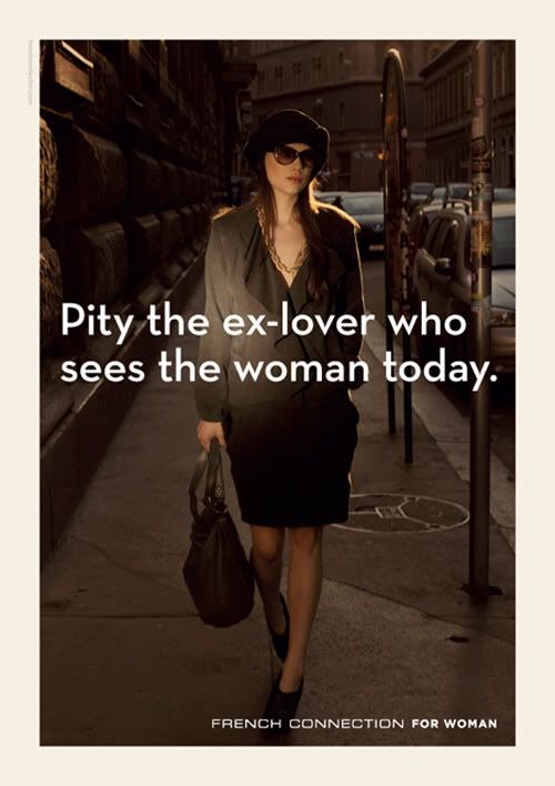
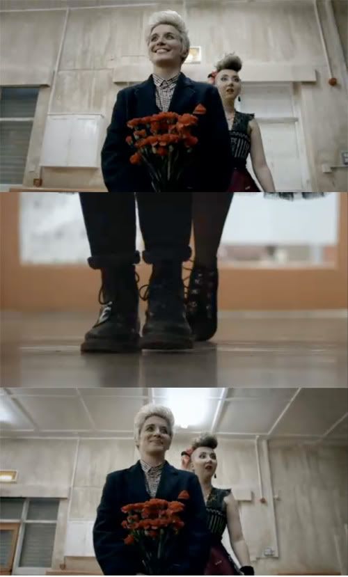
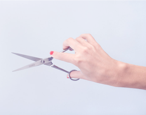
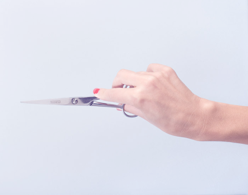
This is by far my favourite advertising campaign as of late - and yes I am aware of the rest of the world blogging about it too.
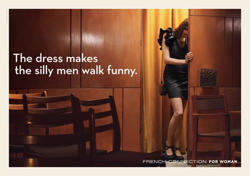
The new campaign created by Fallon scrubs away the chavish culture that was associated with it's 'witty' FCUK branded t-shirts. Which although suitable for a 90's lad culture, have damaged the brand and brought it down away from the higher status they wanted to uphold. This new campaign looks at launching them back up to fight with brands like Diesel.
The new campaign references Jørgen Leth's 1967 short film The Perfect Human which can be watched here. it is more high-brow and a little bit daft. It's nice to see a sense of humour and warmth in fashion advertising which is all to elitist and cold. Because of this I think it really works. It is different, the art direction of photography is incredible, and the choice of models are unusual - as well as being farcically smooth, (I want the Man's beard). The overlaid type is bold and strong (and a lovely looking typeface too).
Now the only problem I have with this campaign is with the woman's side. It seems an afterthought, and other people think this too. There is too much of a split between the man and the woman; the Man has layers of humour, and emotion, whereas the Woman seems flat and one dimensional. Aswell as this the Man has nice big bold uppercase copy whereas the woman has lowercase copy, the copy writing is in a completely different style too. She is viewed from the male perspective, because of this it seems the whole campaign was designed by men, and very few women had an input.
But none the less it is good to see some fashion advertising taking a different tact for once, and I think it works.
This Is England 86
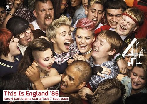
I just finished watching Shane Meadow's 4 part series 'This Is England 86' on catch up TV. The series carries on from the film This Is England released in 2006. Shane states that he had a wealth of 'material and unused ideas that I felt very keen to take further.' He stated that 'audiences seemed to really respond to the characters' and the 4 part series would tell the rest of the story.
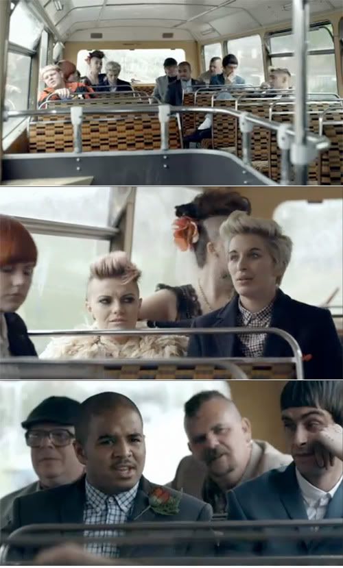
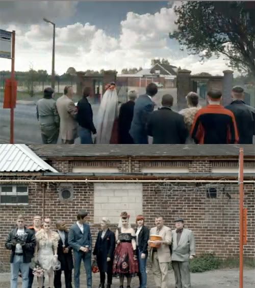
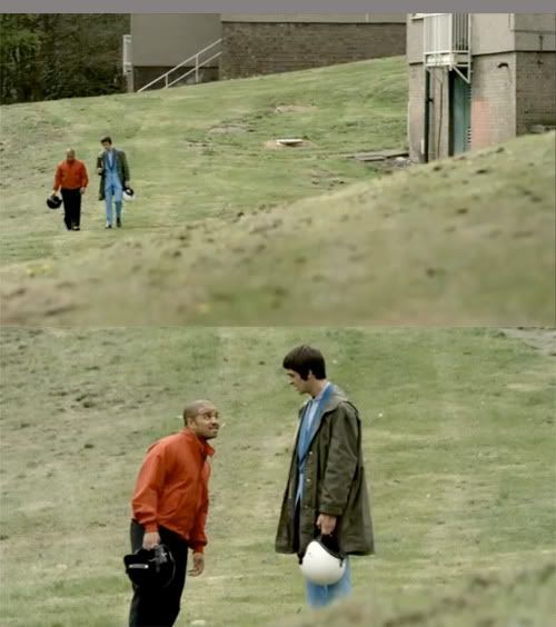
The series documents the characters of this is England over the Summer of 86, set against the backdrop of the World Cup. I thought the series was amazing, I much preferred the 1st and last episode. The first was directed by Tom Harper who has previously worked on Skins. His two episodes seemed to have more of a care-free decadence about them, whereas Shane - who directed the last two, pulled them back into a dark gritty and heartfelt truth.
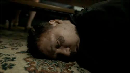
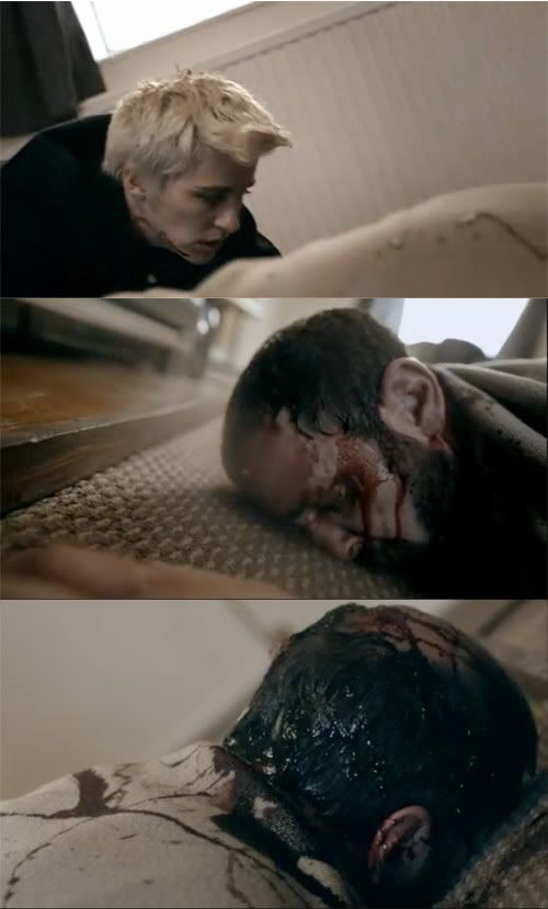
One of my favourite parts of This Is England was the characters, I though it would be interesting to see how they had developed from their Skins past of racism and hatred. I wasn't sure if it would work, if the characters had been constructed with enough depth to work without the hatred of their youth, fortunately, they did. The character that stood out for me was Lol, she was caught in a fierce emotional turmoil of marriage, and sexual abuse from her father, which was all acted out brilliantly, ending in brutal bludgeoned death.
Another part of Shanes film's that makes them so impressive, is his style of cinematography. He uses a lot of handheld close ups which hover close to the face and follow the characters round with an odd haunted perspective. He mixes these with mid-to-long shots showing the characters at distance, juxtaposing a warm emotional closeness of the close-ups with cold isolation of the long shots.
Shane films are incredibly dramatic and emotional, he creates this through the use of music - or lack of in his case. No music can be heard if people are taking. It is completely silent, the only sound you can hear is that being made by the actors, making every scene incredibly eerie and tense.
If you want to see some gut wrenching acting from cut wrenching situations shot incredibly well then please watch. You can see it all on 4oD.
Incredible song taken from the advert:
Wayne Smith - Under My Sleng Teng
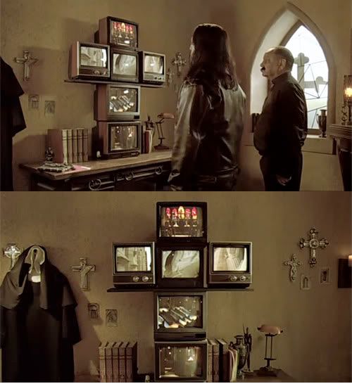
Machete
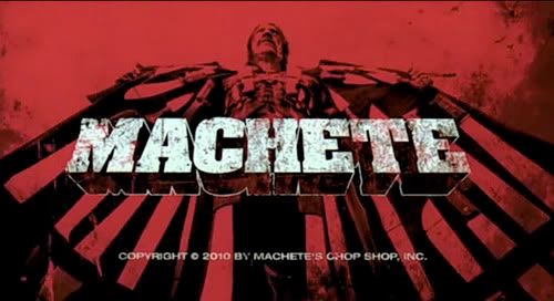
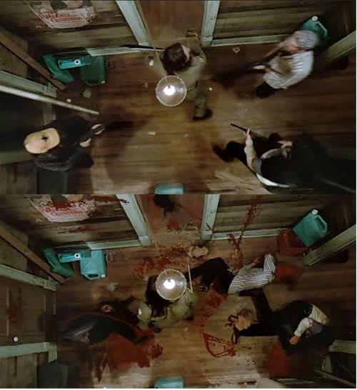
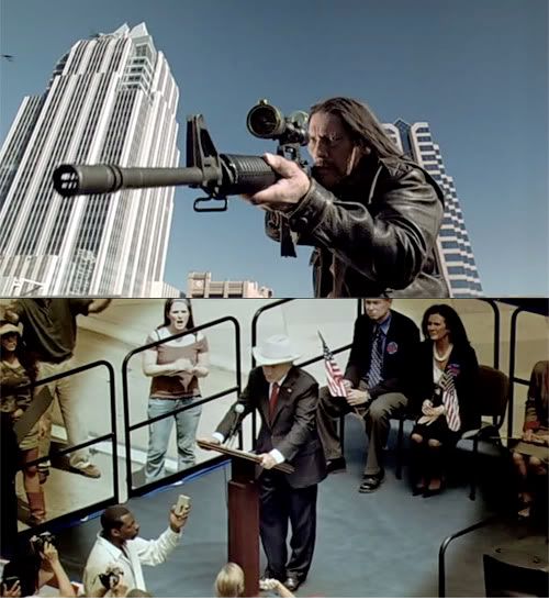
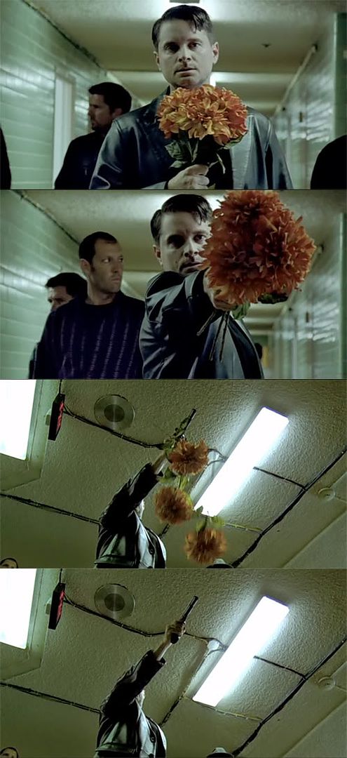
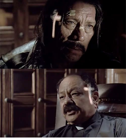
"He knows the score, he gets the women and he kills the badguys"
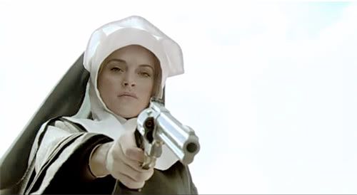
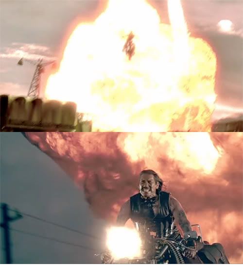
I watched Robert Rodriguez's Machete last night and it was amazing. Although Rodriguez had previously written the film around 17 years ago, he finally made it because of the success gained from it's trailer filmed by Rodriguez to sit between his and Tarantino's grindhouse flicks - Planet Terror and Death Proof - also a must see. (See below). The film stars the most Mexican looking man of all time - Danny Trejo, De Niro and Segal, followed by a whole host of ladies including Jessica Alba, Lindsey Lohan and Michelle Rodriguez.
Machete follows on with the same grindhouse scratched and scathed analogue film and includes: horrific deaths with a kill rank pushing the hundreds, a lot of naked women and incredible one-liners, non of which can be taken seriously. Rodriguez's political view is obviously felt and his comment on exploitation films is clear. Non the less this is an incredible film that will undoubtedly offend the majority of people.
Machete will be followed by two more films titled 'Machete Kills' and 'Machete Kills Again,' and I already can't wait.
Also not to forget the incredible drum and bass remix by Hazard:
Friday 24 September 2010
Tuesday 21 September 2010
Justin Walker


Justin Walker's unsettling photography juxtaposes the raw and dangerous against sweet childhood pastels, and the result is oddly sexy. Although his photos are static, they are charged with energy. The composition forces you to ask questions, and makes the viewer write their own backstory, giving the photograph it's meaning and context. The posed and constructed nature of each photo coupled with it's soft colouring and styling gives them a plastic and fake 1950's feel.
The rest of Walker's work is amazing, and well worth checking out.
Friday 17 September 2010

Friday 10 September 2010
Song Of The Week 10.09.10
Bestival related Song of the Week
Fever Ray - When I Grow Up
I can’t wait to see her.
Wednesday 8 September 2010
"Flash forward a month later. You’re struggling to come up with new ideas, fresh thinking, sound logic. You see awesome work being posted on Dribbble and FFFFound. Everywhere you look, you’re wishing you had made this, that, and the other thing. You’re wondering if you’re even cut out for the world that is design. Hell—why the world can’t see aesthetics, logic, and experience the way you do. You wonder if it is all pointless. Your parents wanted you to be an engineer and you let them down for that fancy-pants art school. You envy the mundane: the mindlessness of it all. Screw it—you’ll be happier flipping burgers. Maybe you’ll come up with a fancy way to swirl the ketchup and mustard into the restaurant’s logo."
Design is a Drug
Design is a Drug
Tuesday 7 September 2010
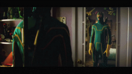
Kick Ass

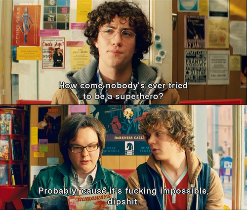
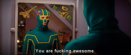
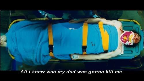
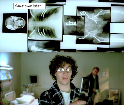
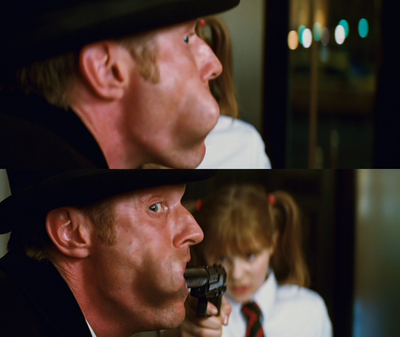
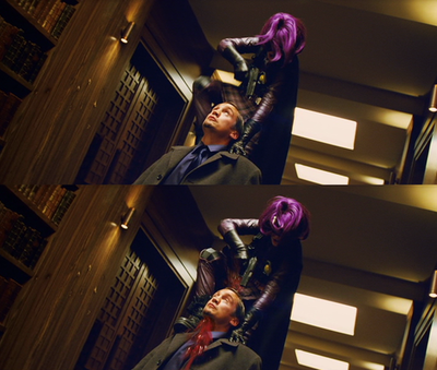
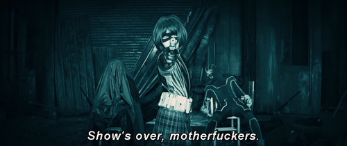
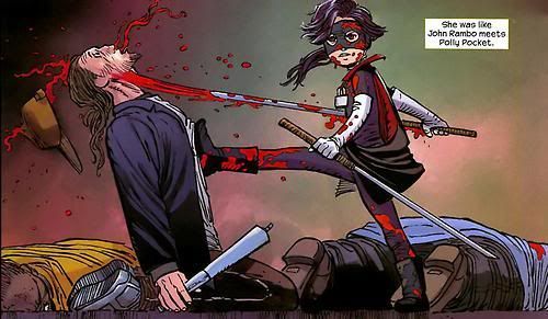
I watched the aptly named Kick Ass the other day. The film's amazing, you can really relate to the characters and the films main premise. It plays on that awkward part of you that always wanted to be a super hero when you were a little kid, jumping over sofas and pretending that you could run up walls. The film has a teenage warmth and nostalgia about it. It keeps the split of true superhero / wannabe superhero really well; with Kill Bill influenced scenes of outrageous blood and deaths, with loads of real life teenage comedy thrown in, staying true to the comic's original form.
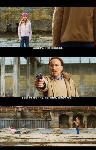
The comic's artwork drawn by John Romita Jr. is incredible. The line style and line work make the book's artwork totally original. The comic uses no solid blacks, which is 100% key in all other comics and is the main aspect that creates the images. Other comics like Frank Millers Sin City are rendered completely in black, creating shapes out of negative space. But With Kick Ass it is totally opposite, because of this the every frame pops with garish colour - and this translates into the film really well. Every room, costume, and colour totally pops, and it's incredibly noticeable; creating what feels like surreal primary bloodbath.
In a review written in the guardian Peter Bradshaw states that Kick ass brings superheroes into a our time; and how the use of social media drove his superhero celebrity status. He writes: "Kick-Ass, with an unconscious talent for divining the zeitgeist, has made the powers of the internet work for him: YouTube makes him a star, and his MySpace page builds his career. Peter Parker may have been bitten by a radioactive spider, but Dave has been bitten by the web celebrity bug. In the old days, Clark Kent and Peter Parker took work on newspapers, because that was how they found out where the action was. That was old media. Kick-Ass uses the online world to self-publish his superheroism."
Read the rest of the review here.
"Design continues to play a more important part in contemporary discourse because it deals with the way we feel. For all of us, design must be an experience regardless of medium; whether it is print, environmental graphics or identity creation, the outcome must stand out and truly connect. Our designers are compelled by the view that design is a cultural imperative and so see it as his or her personal responsibility to create a heightened experience that engages emotionally and intellectually."
This Is What Matters To Me

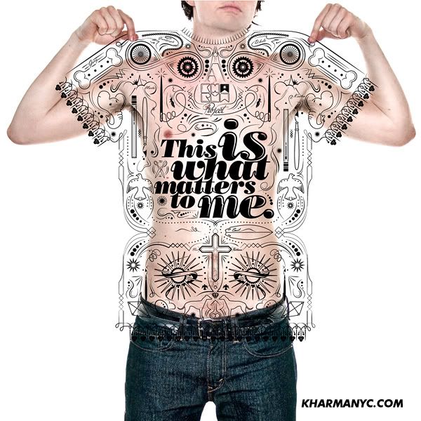
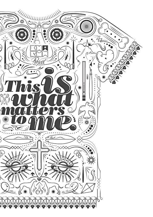
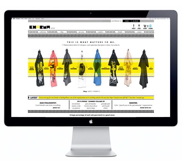
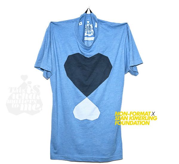
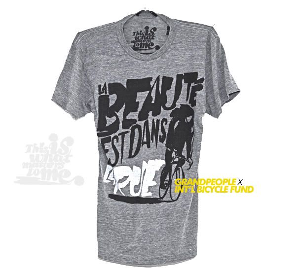
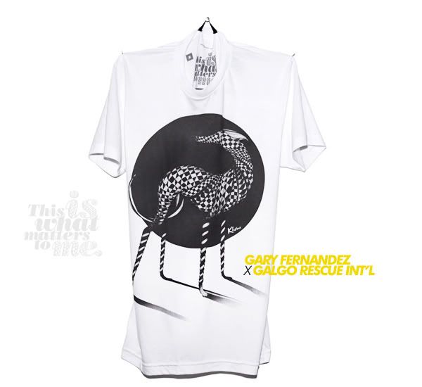
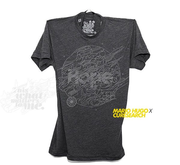
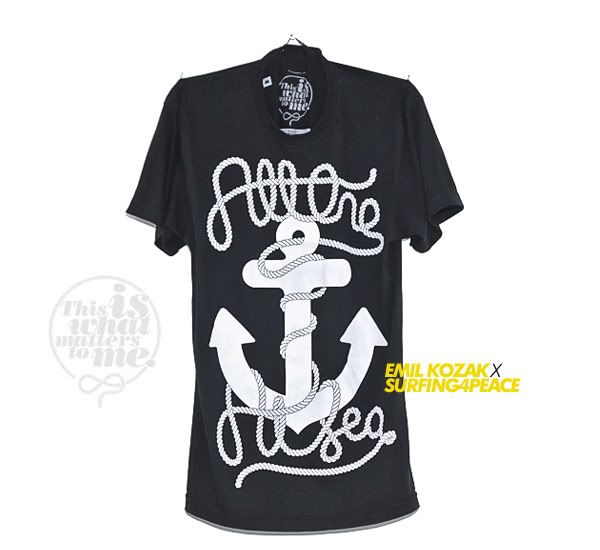
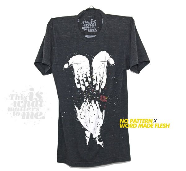
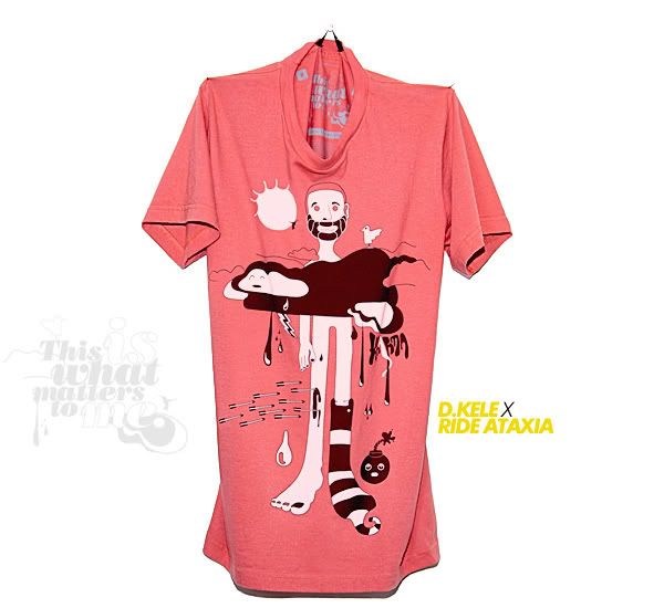
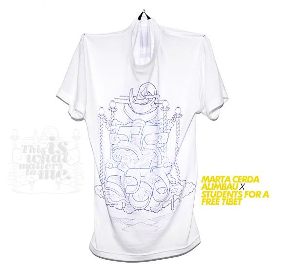
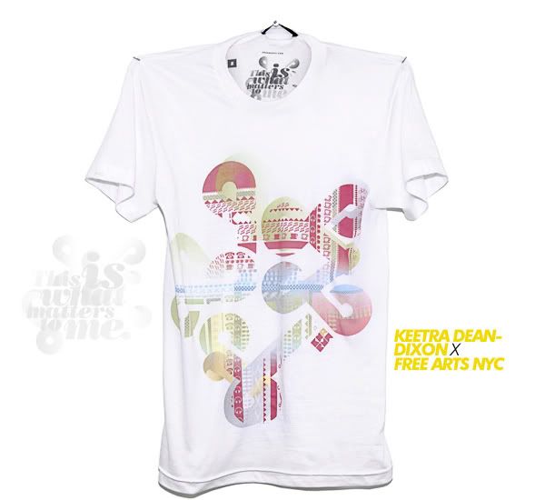
'This Is What Matters To Me' is a project started by Kele Dobrinksi based on Karama and bringing some exposure to some lesser known good causes. It showcases designs from "designers, bloggers, creators, foodies, shitty skaters, urbanites, and maybe above all, consumers," who love uniqueness and beautiful things. The project produces limited edition T-shirts designed by the likes of Non-Format, No Pattern, Mario Hugo, Keetra Dean-Dixon, and a few more.
"Kharma is our method of creating beautiful products that have a tangible effect on the world around us. "
Subscribe to:
Posts (Atom)
