
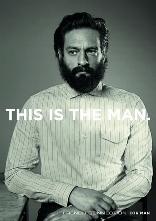
This is by far my favourite advertising campaign as of late - and yes I am aware of the rest of the world blogging about it too.
The new campaign created by Fallon scrubs away the chavish culture that was associated with it's 'witty' FCUK branded t-shirts. Which although suitable for a 90's lad culture, have damaged the brand and brought it down away from the higher status they wanted to uphold. This new campaign looks at launching them back up to fight with brands like Diesel.
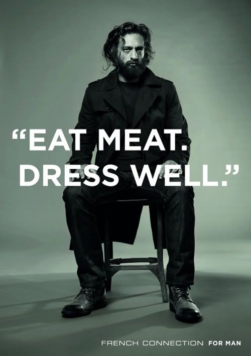
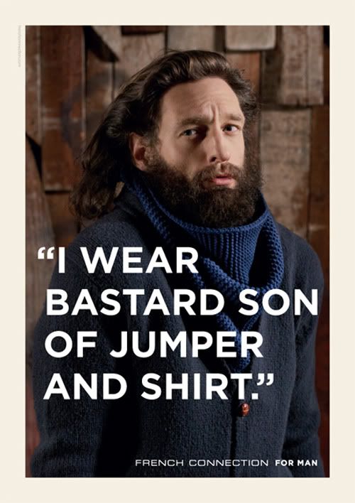
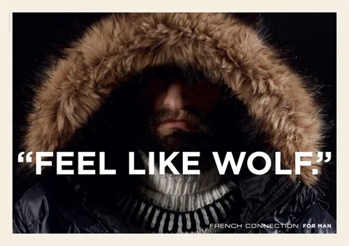
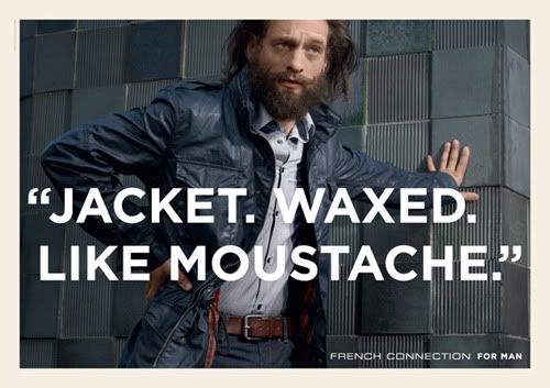
The new campaign references Jørgen Leth's 1967 short film The Perfect Human which can be watched here. it is more high-brow and a little bit daft. It's nice to see a sense of humour and warmth in fashion advertising which is all to elitist and cold. Because of this I think it really works. It is different, the art direction of photography is incredible, and the choice of models are unusual - as well as being farcically smooth, (I want the Man's beard). The overlaid type is bold and strong (and a lovely looking typeface too).
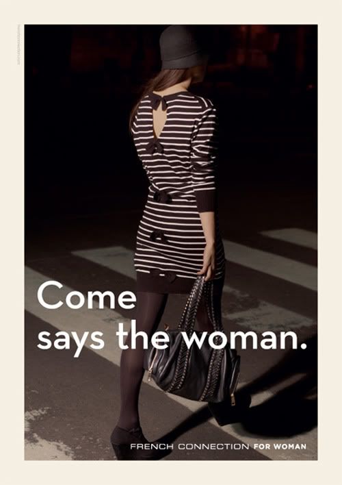
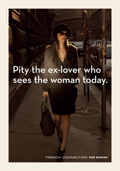
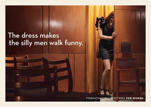
Now the only problem I have with this campaign is with the woman's side. It seems an afterthought, and other people think this too. There is too much of a split between the man and the woman; the Man has layers of humour, and emotion, whereas the Woman seems flat and one dimensional. Aswell as this the Man has nice big bold uppercase copy whereas the woman has lowercase copy, the copy writing is in a completely different style too. She is viewed from the male perspective, because of this it seems the whole campaign was designed by men, and very few women had an input.
But none the less it is good to see some fashion advertising taking a different tact for once, and I think it works.

I find these adverts so fantastically well done, it's such a change for FCUK, which has, to be honest in my opinion, being going down in both fashion, advertising and branding over the last few years. They have clearly had a bit of a rebrand as the stores have changed and the colours and tones of all the stores fit together well. They have almost matured, become a little be calmer and more appealing to walk in to. I thought the way they plastered these adverts all over stylist on the first day of their release was also a clever PR plan.
ReplyDelete