Friday 29 October 2010

Rationale

Right from the offset of this project I found keeping a blog hugely beneficial. Blogging is something I had started doing on and off throughout my year in industry, and is something I find very beneficial. From reading and clicking through the numerous professional and student blogs all logged up in my toolbar, to logging and archiving things, objects, designs and thoughts that I found interesting. This way when I started a new project I had a backlog of interesting and beneficial pieces of designs I could look over, to gain inspiration and kick start my own creative process. When I started the university blog I found it a great way to research the projects at hand, as well as documenting my own findings in the research for my dissertation. 
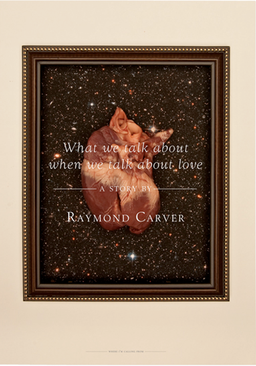
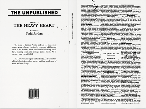
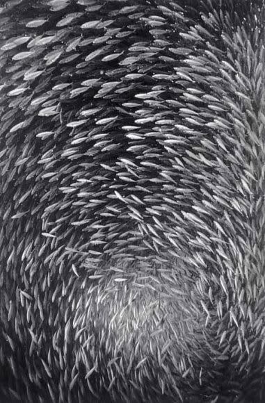
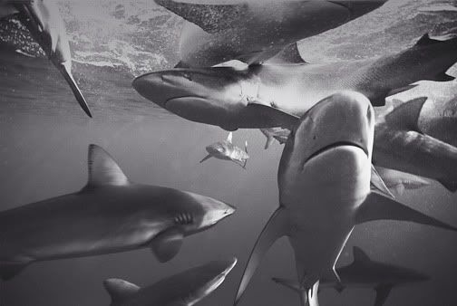
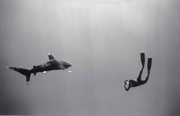
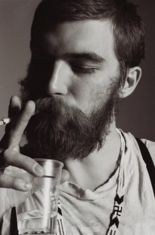
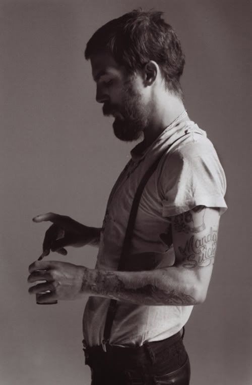
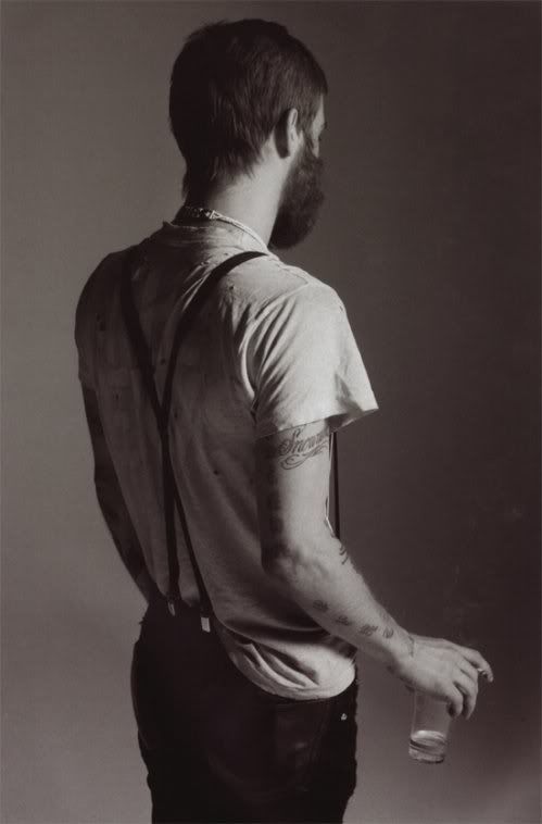
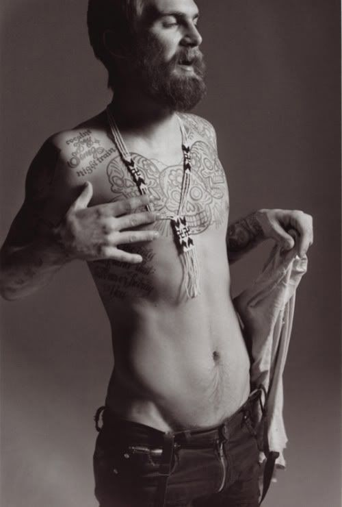
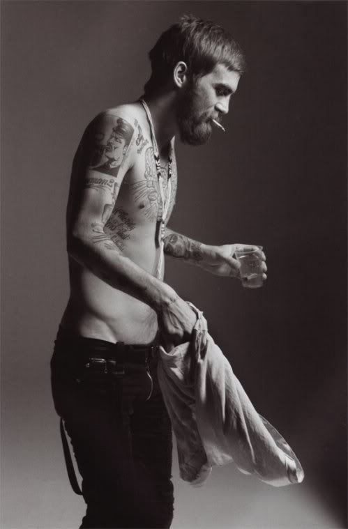
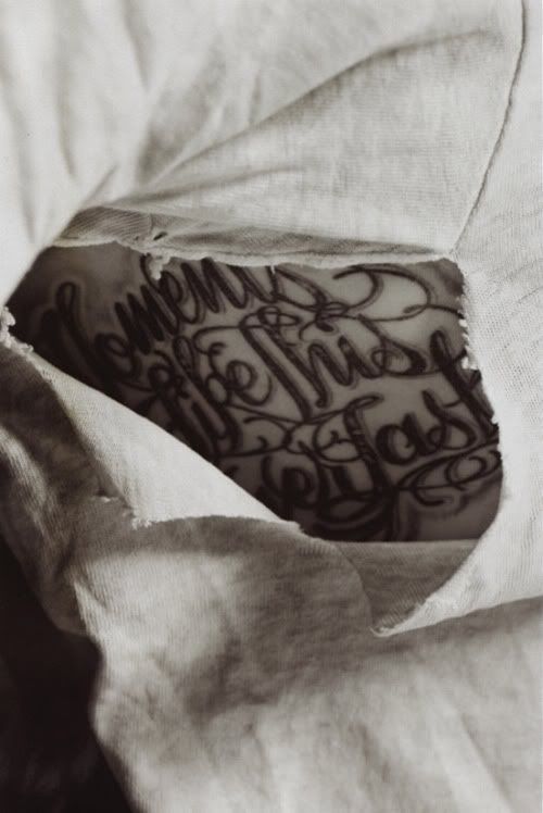
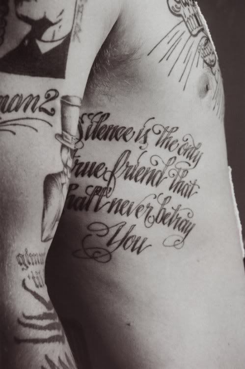
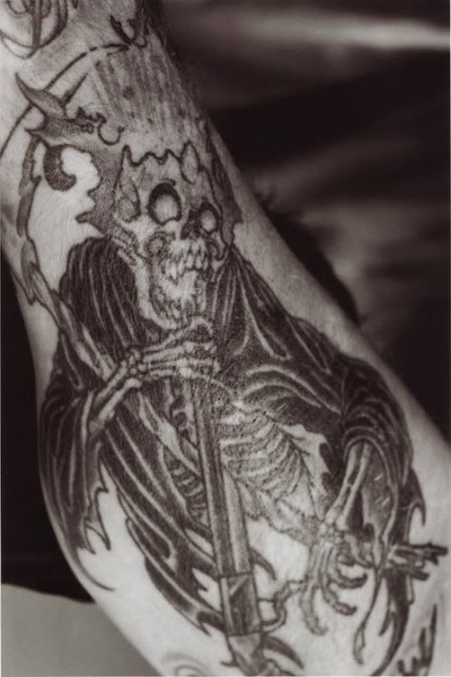
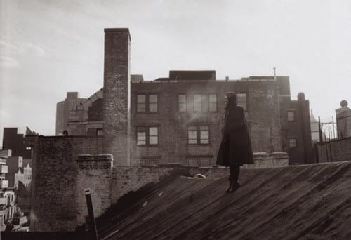
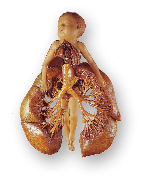
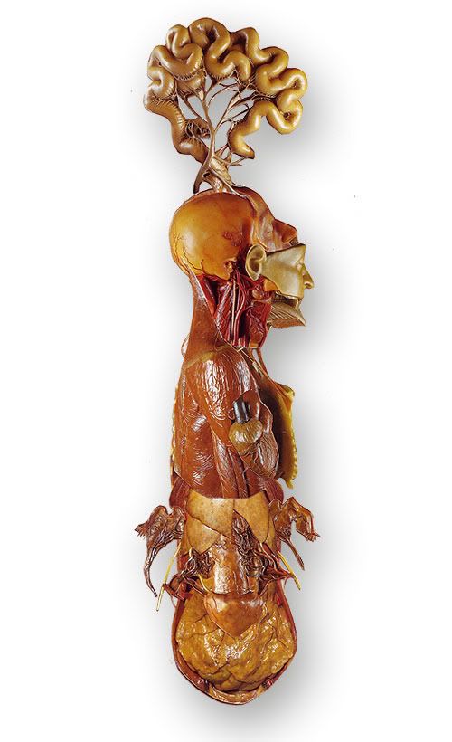
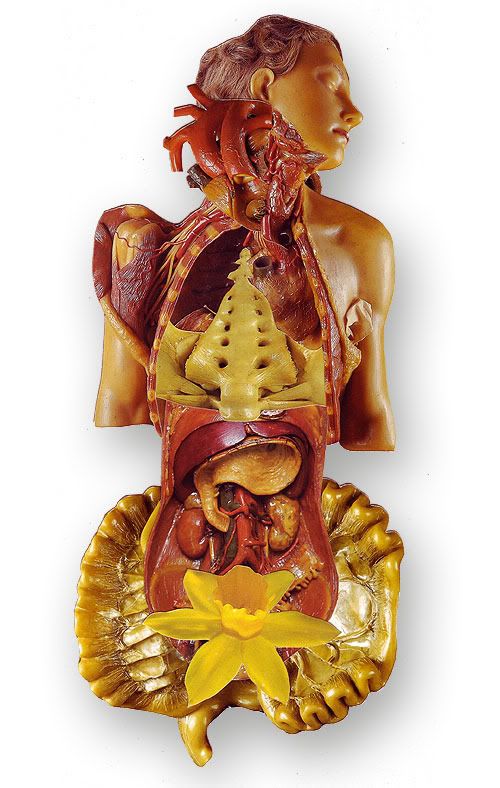
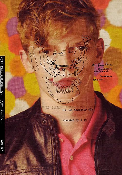
I aimed for my blog to be purely inspirational to me, although a bit self indulgent, it made it more personal and relevant to myself and exploring my own style and influences. Looking back over it now it is possible to see clear trends, styles ideas and concepts which run through my work. This has given me a more informed and higher understanding of how the work I create and aspire to. I can see clear areas which I have focus on, such as layout and grid structures, rigid and refined type and typography, the dark and macabre side of film and cinematography, portrait photography, and strong creative idea lead design. I found that I tend to prefer and sway towards a darker and more sinister approach from the collection of blog posts, whether this is with comedy, styling, art direction or ideas; and for some reason skulls seem to be a re-appearing influence (see posts: 1, 23, 4).
Making the blog as personal to me as possible meant that some of the seven areas that were set got neglected - this wasn’t an intentional “I don’t like that subject I’m not going to look at it’ view, It was more a factor that I didn’t find it interesting, or influential to the work I want to create in my final year, so I didn’t see it relevant to my research. I want my third year to focus on the work I want to be a part of when I leave university, this unfortunately means that architecture was left out. Areas that I found more beneficial were: artists, film and design, all of which I draw from for inspiration regularly in my own work. 
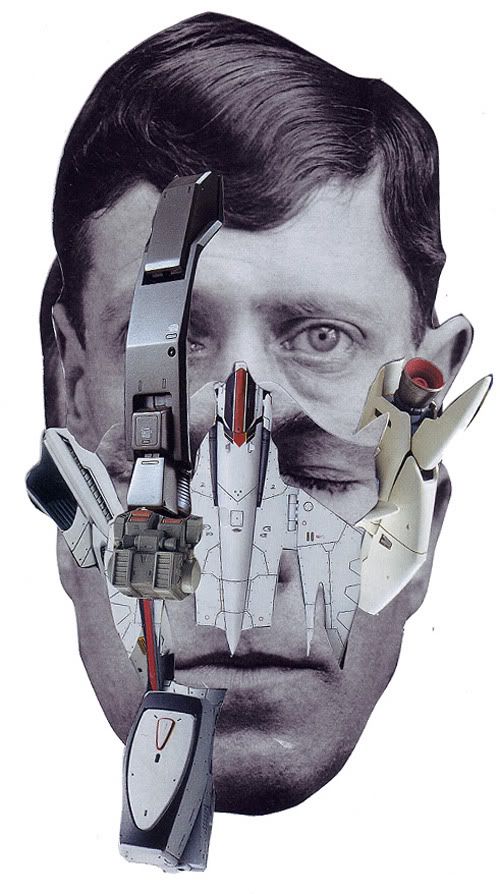
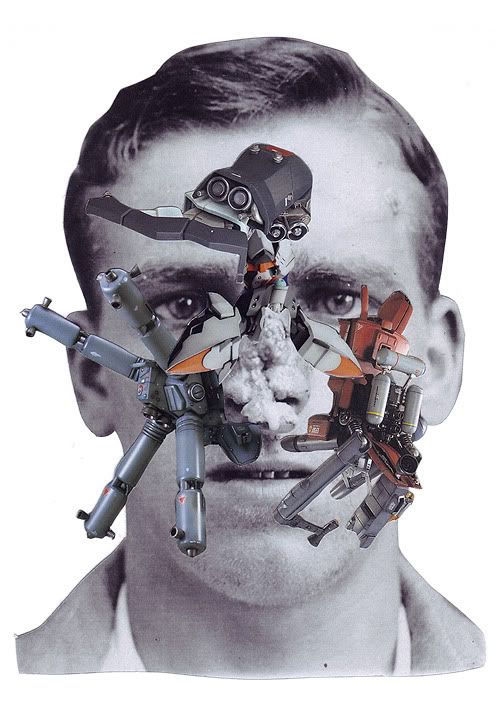
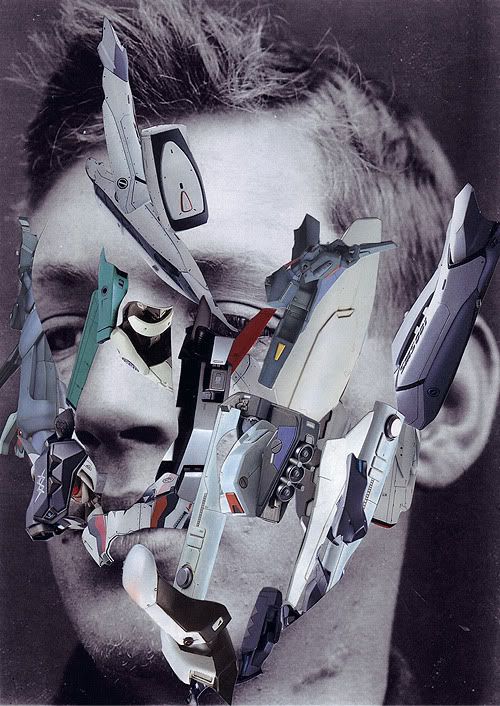
Looking at my blog as a whole there is a clear narrative and synthesis of ideas and styles. The blog posts start of wider and more sporadic, with influence and inspiration points taken from sources such as: live musicproduct design, tattoosquotes and street art. As time progressed through the three month blogging period, I tried to reign these in, and make my research and findings making them more relevant to the work and current projects I had on at the time - as well as future ones that are looming at the end of the year, such as my dissertation and final project. This meant focusing on books that were relevant to my dissertation, looking at style and structure which would benefit my current projects, as well exploring other ideas and forms which could benefit my work and widen my knowledge and understanding design. For example the use of 3D, shown and utilised incredibly by Mark Barcinski and Adrien JeanJean with their 3D portfolio site. would be an incredible area to explore for a final project. 
Although there are clear themes, and a general style and structure to my blog, I found that through taking part in the whole blogging process - reading and commenting on other peoples blogs that their work had a neater and cleaner focus. They knew what they wanted to focus on, whether it was branding, advertising, or animation. My influences and work came from seemed more varied, and there wasn’t as clear a direction and end point as everyone else's. I have found that I am still unsure at what I want to focus on, I enjoy and like too many parts of the creative world that is Graphic Design. I enjoy photography, and film based work, but I also find the nuances and refined style of typography, as well as fashion music, and branding incredibly interesting. I found that on my year in industry I worked on a huge number of projects, varying from stop frame animation to worldwide advertising, to typography and print, to web design. I want to be part of an agency or design group that has this variety in their work. I don’t want to be pinned down to a certain style or area. I enjoy being involved in the whole process of design, and that is what has really stood out to me from this blogging process. 
I understand the value of specialising in a subject, it gives you a higher understanding and knowledge of that area, making you essentially more employable and different to other designers. But at the moment i don’t want to make the decision. I like the flexibility that there is in graphic design, and the way it is different from one week to the next, and that is what excites me. So in reflection this blog is of more benefit to me, because of that varied and wide range of sources and influence. Each project is unique and you never know which piece of design you blog about may be of benefit in the future.
Knowing these factors and influences now puts me in a great place for my final year. From working in my year in industry and documenting my style influences over the summer in this blog, I have found and realised the areas - or lack of that I like. It puts me in a great place for my dissertation and final major projects (as well as graduation and job hunting). Not only do I have a back catalogue of useful ideas, styles and designs, I know have a better understanding of what I like in design and what I should pursue in future. This means that come final project time; I have a spring board of work that I can jump off and get thoroughly involved in creating an out standing piece of work which I will enjoy.
Aims and objectives for further development:
- Keep a varied range of sources for influence - you never know where the next piece of inspiration will come from
- Synthesize my own ideas down and complete more posts relevant to my dissertation topic and the relevance of creativity and originality
- Start to think about topics and areas for my final project from posts and ideas in the blog
- Always search for more information and sources of research

Song Of The Week 29.10.10

A massive 80's classic: Africa - Toto

Moving Brands - Living Identity

Photobucket
Photobucket
Photobucket
Photobucket
Photobucket
Photobucket
Photobucket
Photobucket

Augmented Reality. from Moving Brands on Vimeo.

The incredibly beautifully designed self initiated project titled 'Living Identity' by Moving Brands aims to convey one of their beliefs that: 'a brand must be alive to change.' To illustrate this to the four different covers to the piece of literature they assigned a different piece of AR technology to each logo. When the logo is placed in view of a webcam it shows a feed from either Flickr or Vimeo. This shows their work from constantly updating feeds. This is a genius way of showing off your work in an area of design which is just taking off. Augmented Reality is slowly starting to be used be varying companies, and I can see it becoming a bigger part of design in the future - but not for some time.

As you would also expect from Moving Brands the literature is also a beautiful piece of print publication. Well structured and gridded it with a clean and small colour pallet consisting of greys, whites and green. What is interesting for me about this piece of print design is how they have kept the grid structure as part of the design. The faint key lines let you see how they have constructed this piece of work - which is hugely beneficial for students, who are always aiming to better themselves and aspiring to produce work like this.

I have a growing fascination with grid structures and the layout of design which started with the book I blogged about here. Looking at work from hugely aspirational companies like Moving Brands, it is always useful to know how they went about creating the designs. I can take pieces of information and learn from them bettering my own work.

Andy Callahan

Photobucket
Photobucket
Photobucket
Photobucket
Photobucket
Photobucket
Photobucket
Photobucket
Photobucket

Andy Callahan has made typesetting skills. He is a recent graduate from Leeds Metropolitan Uni just round the corner - he has some phenomenal work. He was one of It's Nice That's Graduates of 2010.

Andy's work - although slightly indulgent, mainly focuses on typography, of which his knowledge is amazing. He typesets whole stories on the back of posters with incredible care and intention to detail. I love his clinical and informative style. His worked based on a story of the Bermuda Triangle makes amazing use of the triangle as a graphic device first of all, which then transforms into a fold out poster.

My favourite piece of work by his is 'What We Talk About.' It is part of his design for literature series in which he illustrates the theme and typesets the short story on the back. For this particular story, titled: 'What we talk about when we talk about love' by Raymond Carver uses a framed human heart with overlaid copy, which is a juxtaposition of a disgusting/beautifully raw image. On the reverse the whole story is laid out in a 6 column, double justified grid. It is interesting to see how he pulls the viewer in with the image, and intrigues them enough to want to read the story for themselves. I would love one of these posters.

I aim to be on my way to gaining this level of skill and technical ability in the typography that I produce in my final year. I have to focus on my typesetting skills, and spend more time finessing and making sure everything is perfect. I want to have this level of detail in my work for my final degree show this year.

Thursday 28 October 2010

Tamaru - Figure

Photobucket
Photobucket
Photobucket
Photobucket

Beautiful design for the band Tamaru - a solo bass project. (more information about the artist can be found here). The design concrete imagery and mishmash of grey textures compliments the rigid double justified copy (which I usually hate, but in the this instance I can only find it amazing) all laid out to a basic grid structure on the inside of the case.

I love the simplicity of the whole packaging, the refined type, the monochrome colour pallet, and the concertina fold out of the CD case. The whole thing is a beautiful piece of structured and destilled design which I aspire to create in the future.

Design: Hideho Takemasa
Art Direction: Kitchen
Artwork: April Lee

Wednesday 27 October 2010

Kings of Leon - Where Is My Mind (Pixies Cover)

Too good to wait until Friday. So Massive

Sunday 24 October 2010

Wayne Levin

Photobucket
Photobucket
Photobucket
Photobucket
Photobucket
Photobucket

It is rare that you see underwater photography in black and white, so rare infact that I can't recall a single image/photographer that I've seen before - and this is what makes Wayne Levin's photography so incredible. He creates monochrome foreign landscapes with the movements of waves and rays of light.

I especially like his Surfers set of photographs which creates new landscapes of floating human forms suspended between what looks like a cloudy and troubled sky and a dark looming floor. Another set of his titled 'Fish Schools' creates these new liquid forms that don't even look real. They swarm in and around each other creating new vacuous alien like forms.

Its interesting to look at his work, and to see how such a simple change - such as withholding the colour from what is normally such a colour rich environment - can present something completely foreign to you.

Friday 22 October 2010

Dash Snow

PhotobucketPhotobucket
Photobucket
Photobucket
Photobucket
Photobucket
Photobucket
Photobucket
Photobucket
Photobucket
Dash Snow shot by Mario Sorrenti for Muse Magazine.

Dash Snow is one of the coolest men to have ever lived. He died earlier this year from what was described as a 'junkies end' by a New York Times article. He was a self destructive artist known for his polaroids of nights of reckless drug abuse and other shenanigans from nights in New York. You can see some of his polaroids here.

Song Of The Week 22.10.10

First Aid Kit - When I Grow Up (Fever Ray Cover)

Ashkan Honarvar

Photobucket
Photobucket
Photobucket
Photobucket
Photobucket
Photobucket
Photobucket
Photobucket
Photobucket
Photobucket
Photobucket
Photobucket
Ashkan Honarvadoes some amazing collage and illustration work. He explores human form and identity through a running series titled 'faces.' He looks at the darker side of human existence by looking at faces scared by war, he re-constructs faces of soldiers torn apart by the first world war. Making uncomfortable and unsettling images.

I think his work is amazing, it pushes you to stare and look into faces and images that you normally would avoid, he transforms the grotesque into something interesting that you can look at. And confronts your ability to judge and understand your conceptions of what a human face 'should' look like.

Wednesday 20 October 2010